US GDP Analysis
By Ajinkya Shinde in R
June 13, 2018
1. Relevant R-code
## `summarise()` has grouped output by 'country'. You can override using the
## `.groups` argument.
2. Description of the Type of Graph
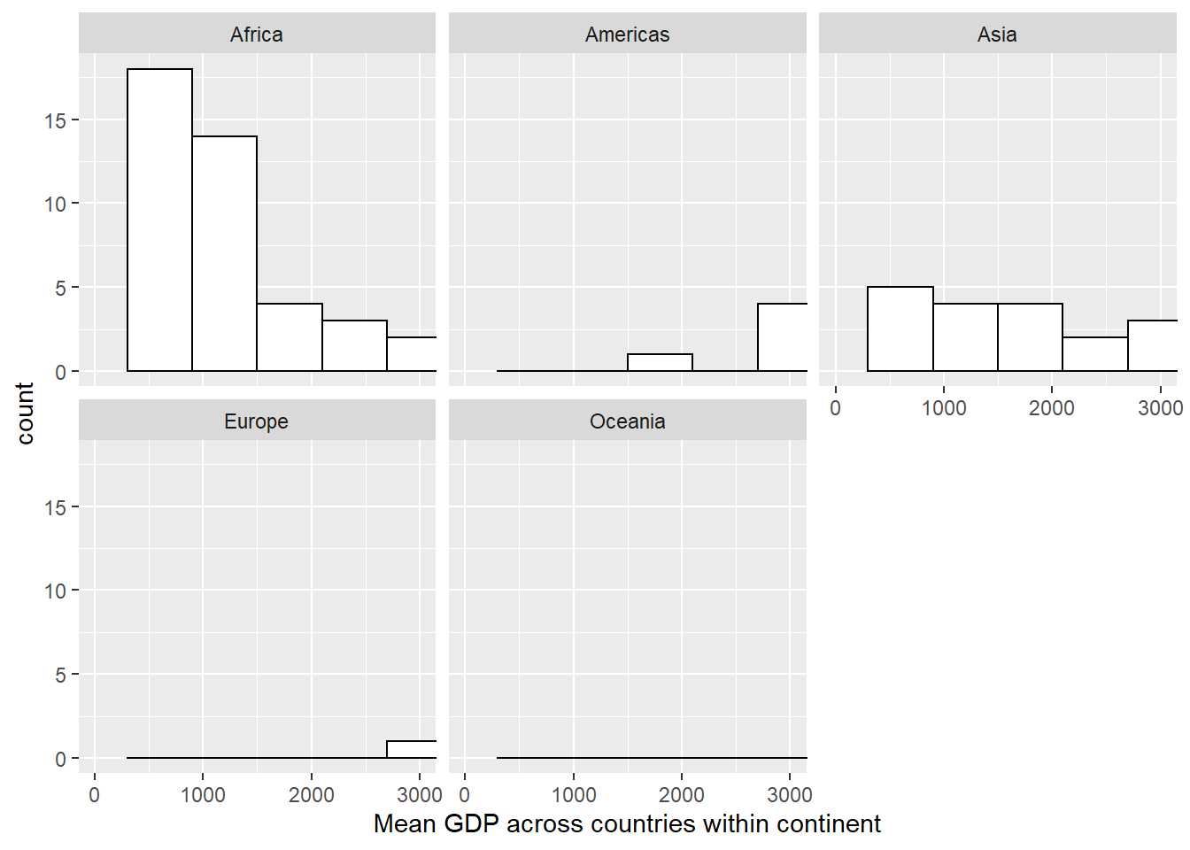
This is a histogram used to measure the spread of GDP across countries within each continent
3. Description of the DATA used
## Rows: 142
## Columns: 3
## Groups: country [142]
## $ country   <fct> "Afghanistan", "Albania", "Algeria", "Angola", "Argentina", ~
## $ continent <fct> Asia, Europe, Africa, Africa, Americas, Oceania, Europe, Asi~
## $ meanGdp   <dbl> 802.6746, 3255.3666, 4426.0260, 3607.1005, 8955.5538, 19980.~
The Data consists of nominal/qualitative variables - country and continent and the quantitative variable is meanGDP which is calculated as the mean of GDP across a country in a given continent
4. Description of the AUDIENCE
This dataset can be used for census analyst who wants to see the GDP growth across the continents from the data set
5. Representation description
In the above graph, we are trying to see the spread of gdp across countries within each continent. The facet_wrap divides the graph across Continent. In each of the individual graph,individual bar line represents mean of GDP across the countries. The visualization can be used to get the sense of skewness/type of distribution across the continent.
6. How to read it & what to look for?
We try to see the skewness and get a general idea of distribution of GDP across each of the continent. A newbie can say that the graph for Europe looks normally distributed and should look to get basic sense of distribution.
7. Presentation Tips:
We can use discrete color palette to differentiate among the different ordinal variables. Also , the distinct color scheme also portrays that the distribution for each continent is independent of each other.
8. Variations and creations:
Below is the variation of the above graph. A ridge line chart below can be used to compare the distributions amongst themselves to see which how the continents perform against each other.
## Picking joint bandwidth of 1730
9. How I created it?
I thought of showing countries in a single graph with graph being created for each continent. Thus, I created meanGDP_country variable to store the dataset in that format.Finally, used GGPlot2 to create the histogram.